This one is a bit odd; via HotWhopper is the WUWT post Obama was right–‘the rise of the oceans began to slow’. This purports to show a graph of rate-of-SLR, and shows it declining. The graph has no clear source, the post says “h/t to Dr. Pat Michaels”. And down in the comments Michaels admits to it, so it must be his. However, it appears to be simply faked [*].
But weirdly, crudely faked [*]. All of this is at HW but: first of all the recent data showing that SLR isn’t declining, has been omitted. This is just std.denialist stuff. But then the graph has been smoothed or mangled in some unspecified way, presumably to remove noise, so it looks like a smooth decline. After a bit, Michaels shows up in the comments and says “I posted this for funsies” Its not clear what he means by this: that faking graphs and presenting them as though genuine is funny? [Its not clear what the original context of this is; maybe it made some sense in context. Anyone know where he first posted it? I tried to check this new-fangled “twitter” thing but it didn’t show up.] I don’t think he was deliberately spoofing WUWT and its band of unthink commentators – as you’d expect, the obvious idiots (James Padgett, etc.) all fell for it. But its too much even for the slightly-less-than-stupid WUWT folk: even they manage to notice that it doesn’t at all fit with the obvious publically available obs.
[Thanks to commentators: the source is http://www.worldclimatereport.com/index.php/2012/09/10/sea-level-acceleration-not-so-fast/. That makes one thing quite clear: Michaels was lying when he said he posted it “for funsies”; that’s his std I’m-really-serious type stuff. It does however excuse the lack of 2012 data – he posted that in 2012. It doesn’t excuse WUWT picking up and running with out of date junk, though; nor does it explain just what Michaels did to end up with that particular plot. I see there is now an update at WUWT (which still doesn’t source the plot); everyone who has pointed out his errors is a “whiner” it seems. I think if you were being honest about this you’d just reproduce the http://sealevel.colorado.edu/ chart, and perhaps note that its a short series because its from satellite, and if you want a longer series you need to look at tide gauges; I can’t see that Michaels “analysis” adds anything useful.]
[* Update: I think I have to be honest and correct myself here: it isn’t faked; the best analysis I’ve seen is by Bluegrue who reckons Michaels has got his values from regression, although Michaels values appear to be wrong.]

Perhaps “I posted this for funsies” is in homage to Roy Spencer’s classic “The 3rd order polynomial fit to the data (courtesy of Excel) is for entertainment purposes only” , e.g.
http://www.drroyspencer.com/2012/01/uah-global-temperature-update-for-dec-2011-0-13-deg-c/
LikeLike
Looks like this is where the graph came from:
http://www.worldclimatereport.com/index.php/2012/09/10/sea-level-acceleration-not-so-fast/
LikeLike
A Reverse image search shows quite a number of examples of this graph.
Looks like it comes from the World Climate Report on the 10th of September 2012.
Maybe it was intended as a fun post:
But not up British standards.
[Thanks (and to BD). So that’s one up to Stoat readers over WUWT readers, who don’t seem to have found the source; or perhaps they just didn’t care. Though even comparing you to WUWT readers is a bit insulting; my apologies 🙂 -W]
LikeLike
Anyone want to lay odds on how many years WUWT commenters will talk about sea level rise slowing down? Lord knows they talk about the “normal” arctic sea ice all the time.
LikeLike
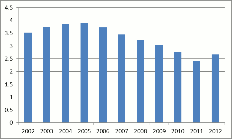
Pat is a master of looking for not-totally-unreasonable-and-yet-somehow-cherry-picked metrics that make the “climate change isn’t as bad as we thought” argument. In this case, it is taking 10 year trends. It would be a better if he did a running plot, rather than a year-by-year plot. If he had done that, he’d get a maximum 10-year rate of SLR of 3.9 from mid-year 1995 to mid-year 2005, a minimum of 2.4 from early 2002 to early 2012, rising to a rate of 2.7 for the latest date I have in my spreadsheet. Of course, this raises questions – why a 10 year rate? Did he choose to do this in 2012 because it happened that 2011 was “the year that La Nina caused the oceans to drop? (that’s rhetorical. The answer is of course yes). etc. etc.
Reminiscent of his graph showing warming rates starting at arbitrary dates and ending in the current period, and comparing that to modeled warming rates, and saying, “see – it isn’t just that warming slowed recently, it is that warming for ANY PERIOD is lower than expected”. Of course, the common denominator of all those rates was that they included the most recent year, which was a cooler than average La Nina year, which would drop the whole plot. All it would take would be a couple warm years to push the entire chart back up.
etc. etc.
LikeLike
Micheals seems to use linear regression, but the data is slightly wrong. Red is the Micheals plot, blue are updated and correct rates (from ordinary least squares).
Micheals plot seems to use only 8.5 data to get his lowest rate instead of a full 10 year period.
Details in my recent blog post.
http://bluegrue.wordpress.com/2013/05/29/137/
LikeLike
Link to a blinker comparison
LikeLike
off past form probably a ten year trailing average
LikeLike
> for funsies
That would be “advocacy science” — done for _funds_ not _funsies_.
Likely just a typo.
LikeLike
[This is std.venus-gravity spam; I haven’t approved the identical posts you’ve put elsewhere on this blog. I direct you to the comment policy, which asks you (if you have a lengthy, and off-topic comment) to simply link to your stuff elsewhere. Anyone wanting to read the nonsense in its entirety can go to http://noconsensus.wordpress.com/2013/05/21/answers/#comment-94579 -W]
LikeLike
The third order polynomial fit of Peter Ferarra to Jack Abramoff is too much for funsies !
http://www.forbes.com/sites/peterferrara/2013/05/26/to-the-horror-of-global-warming-alarmists-global-cooling-is-here/
LikeLike
@Climate_Science_Researcher
Amusing watching Condon getting a taste of his own medicine.
LikeLike
” All of this is at HW but: first of all the recent data showing that SLR isn’t declining, has been omitted. This is just std.denialist stuff. ”
If you made a claim based on data achieved at this moment and one year later there are new data falsifying it, how does ist make your first claim ummoral.
PS: I apologize if there are spelling errors or gramatical errors.
[But this is from a very recent WUWT post. You did read what I wrote, no? -W]
LikeLike
…if radiation from a cooler atmosphere were actually able to add thermal energy to a warmer target…
[You’ve said all this before, no? I’ve cut what I think is your spam without reading it in detail, because I can’t see the point. Was anything there new? -W]
LikeLike
Doug has been banned by Lucia so he has to confabulate at length elsewhere.
To repeat. NET energy over a long period cannot be transferred from a colder to a hotter system, but energy can be transferred in both directions, and when this happens the temperature of the hotter system can increase above what it would be in the absence of the colder system.
[Riley? I hope the usual suspects are complaining about censorship there -W]
LikeLike
… I have been thinking this through for a long time and am now firmly of the opinion that all these energy budgets are incomplete…
[Hey, that’s great! This is your cue to write out the energy budget, completely, using things called “equations” that have been developed just for this purpose. “Equations” are really good, they avoid ambiguity and permit brevity – people called “mathematicians” having been working no this stuff, literally for centuries. You should look it up, maybe take a course – there are any number of places where you can study this stuff, and things called “books” too. Good luck! -W]
LikeLike
Doug Cotton is completely wrong, but loves sharing his nonsense ideas regardless.
LikeLike
“It’s not the trolling, it’s the biting.” — Marion Delgado
LikeLike